Naming Utah's Hockey Team.
Nine full identity directions for Utah's new NHL franchise, designed in real time as the team's naming process unfolded across thirteen months. Including a Mammoth concept posted a year before the team picked Mammoth.
Thirteen months of real-time concept work for a franchise that didn't have a name yet. The directions that survived the fan vote and the one I killed in public. What the official palette leak did to the project. The hidden references built into three of the marks. And the Mammoth I posted in May 2024.
A franchise without a name, a public with opinions.
In April 2024, Ryan Smith's group acquired the Arizona Coyotes and relocated the franchise to Utah. The team began the 2024 to 2025 season as "Utah Hockey Club," a placeholder while ownership ran a thirteen-month fan-driven naming process. Twenty names went to an initial poll. Six made it to a finalist round. The final answer wouldn't land until May 2025.
That gap, between the franchise arriving and the franchise having a name, was the opening. A full identity system for an NHL team is a brief any sports identity designer would take. The team hadn't hired anyone yet, so I gave myself the brief. I committed to drawing full directions, not just marks. Primary logo, wordmark, shoulder patches, home, away, and alternate jerseys for each named candidate I picked up. I posted the work as I made it, dated, in public.
Match the public list. Move with the public clock.
Two rules from the start. The directions had to come from the names the team and the fans were actually voting on, not from my own list of pitches the team would never see. That meant working from the official poll list once it dropped, and reasonable guesses before it did.
The other constraint was time. The naming process ran in public, with announcements and leaks and finalist rounds spaced out over more than a year. Each phase of the team's process changed what a concept needed to do. Pre-poll concepts were anticipatory. Post-poll concepts had to commit to names the team had already validated. Post-color-leak concepts had to rebuild palette by palette to match the team's announced direction. The case study isn't a portfolio of finished marks. It's a record of how a designer responds when the brief keeps moving.
Four phases, nine directions.
The work organizes naturally by what the team knew, and when. Four phases, each with its own logic for what made a concept worth posting.
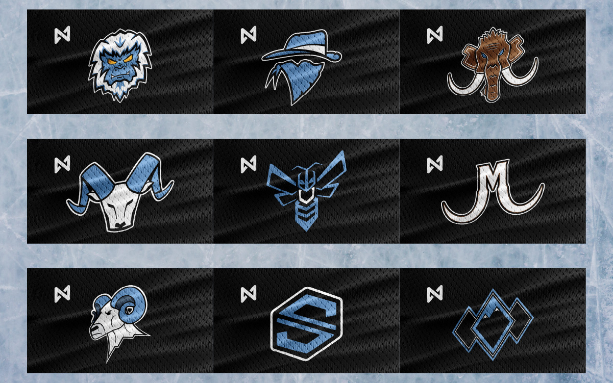
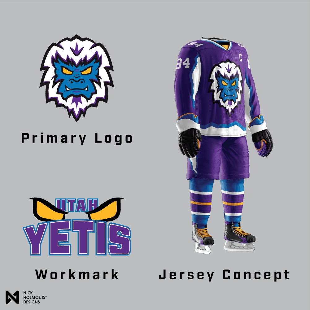
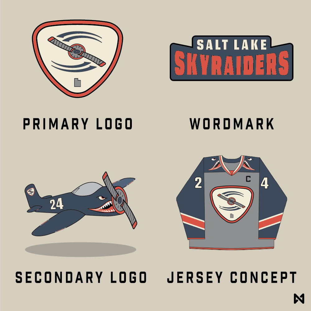
Before the team announced the official poll, the names floating around fan communities were the obvious ones. I started with Salt Lake Skyraiders on April 18, the same day the franchise relocation became official. Then Yeti, Outlaws, and Mammoth followed across the next two weeks. These were bets on what the names might be. When the poll list dropped on May 8, three of my four pre-poll directions were on it.
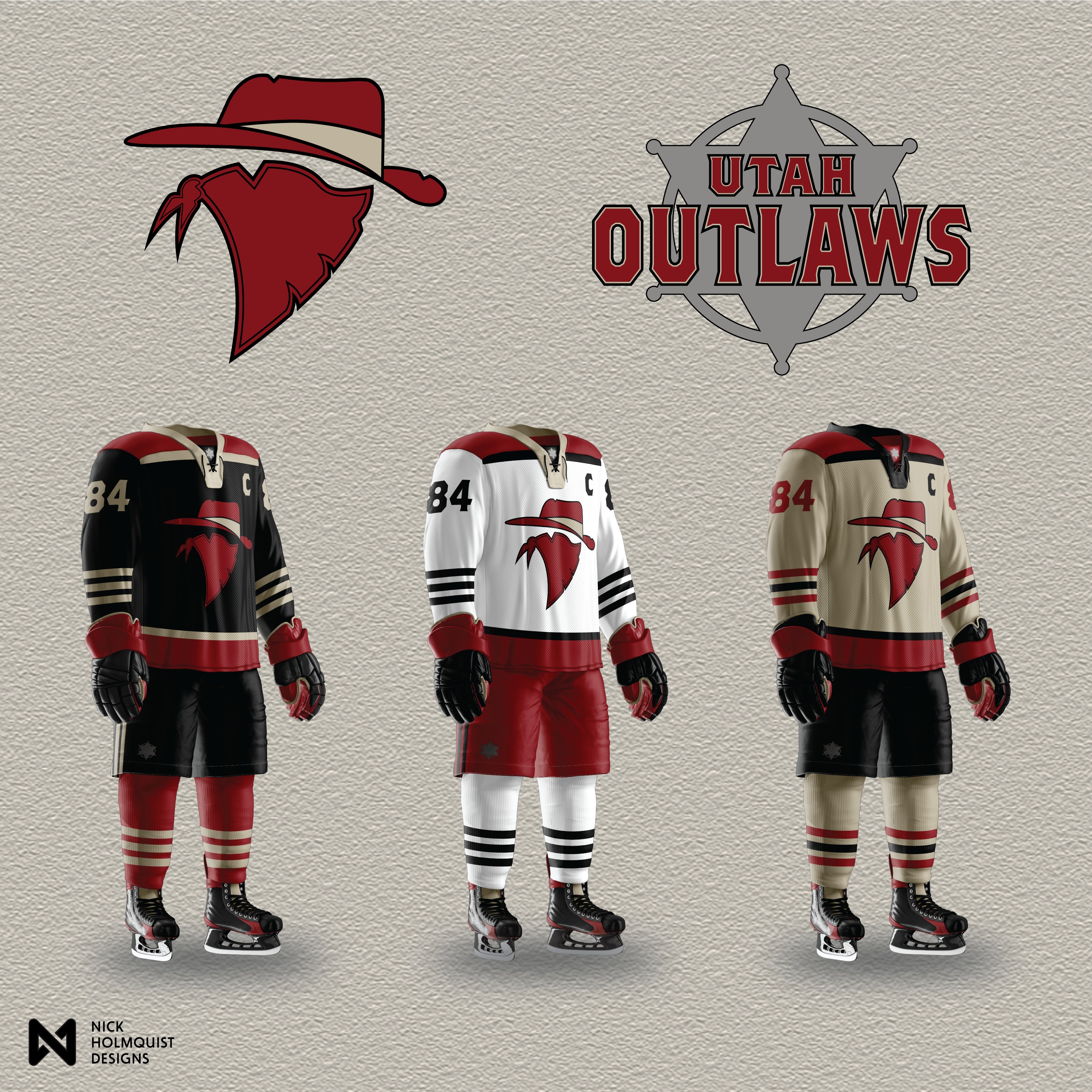
The original Outlaws system also included a separate wordmark exploration. I drew the same sheriff-badge composition for Outlaws, Bandits, and Renegades. The point wasn't to lobby for a name change. It was to test whether the visual system would survive one. A direction that only works for one name isn't a system. It's a logo.
The bandit also hid a Utah state shape inside its bandana. Easy to miss until you see it.

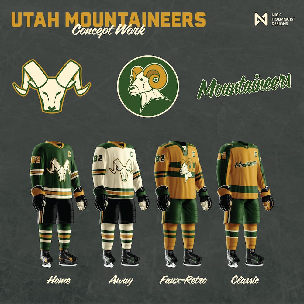
After the team published the official twenty-name poll, the work shifted from speculation to selection. I picked the names with the strongest visual hooks and built them out. Mountaineers, then Swarm, then Black Diamonds. Each direction got the same full treatment: primary mark, wordmark, jersey set. Each one was an answer to a name that real fans were actually voting on.


On June 3, the team's official colors leaked. Blue, black, and white. Suddenly every direction I'd posted was in the wrong palette. Each concept had been designed around its name's own color story. The leak forced a question: keep the original palettes or rebuild everything to match the team's reality?
I rebuilt everything. Every direction got a full recolor into the official blue, black, and white. The point of the project shifted slightly. Pre-leak, the concepts were speculative answers to "what could this team look like?" Post-leak, they were applied answers to "what does this team look like if they pick this name?" The directions became more useful as the constraints tightened, not less.

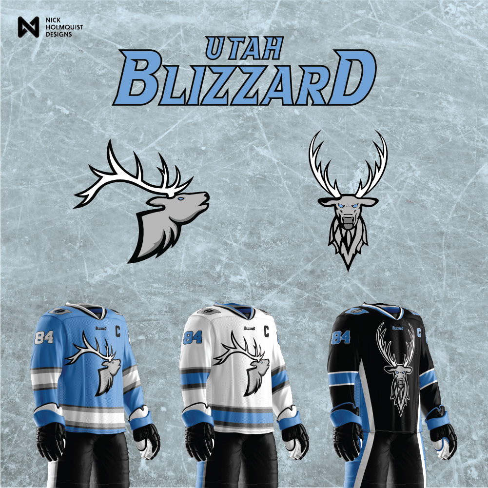
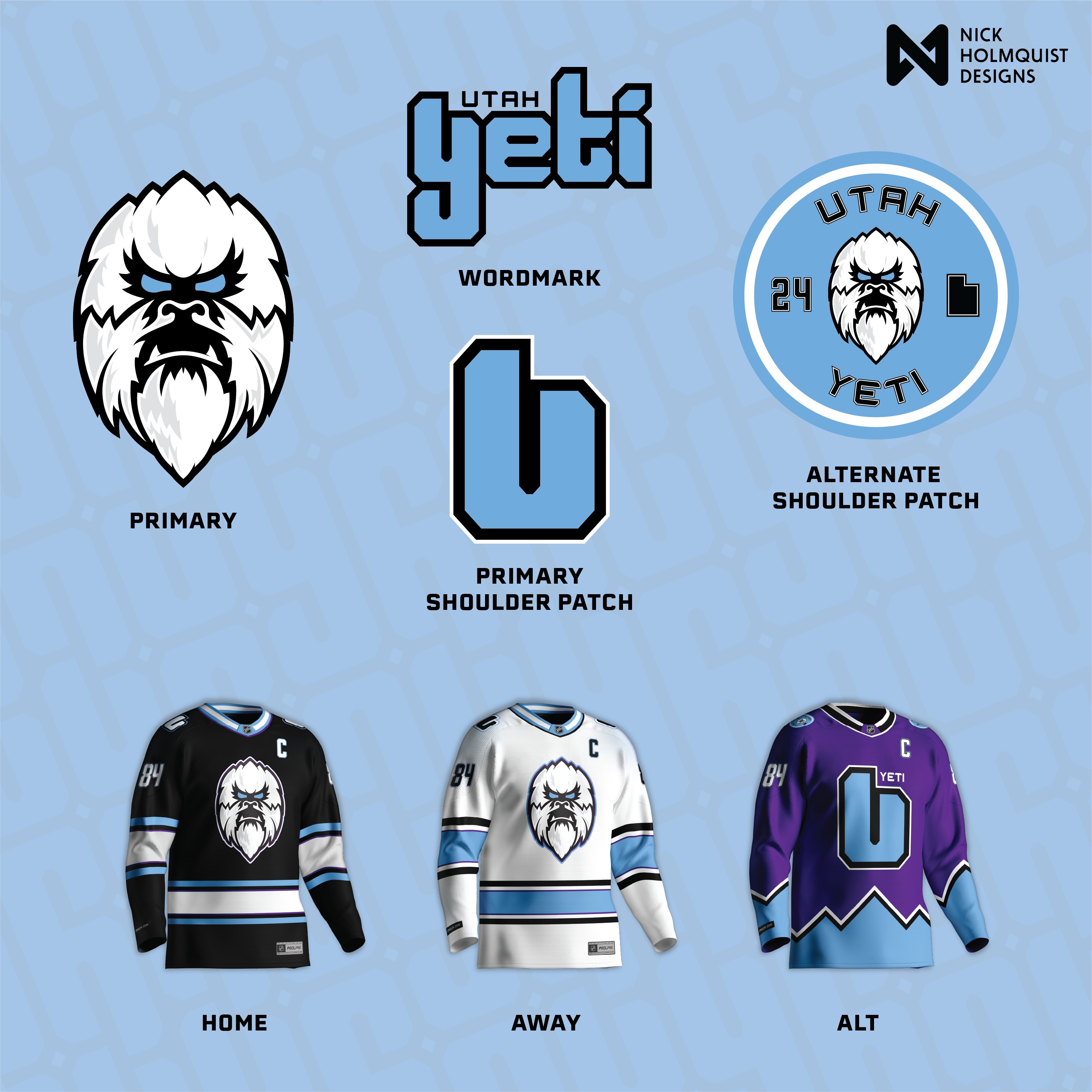
After the official colors landed, the team narrowed the field. Six finalists, then three, then a final answer. The work entered a slower mode. I added Utah Blizzard on June 12. Then iterated on the finalist names with second-pass concepts: Yeti 2.0 in October 2024, Outlaws 2.0 in March 2025. The directions that survived the public vote deserved better versions than my first drafts.
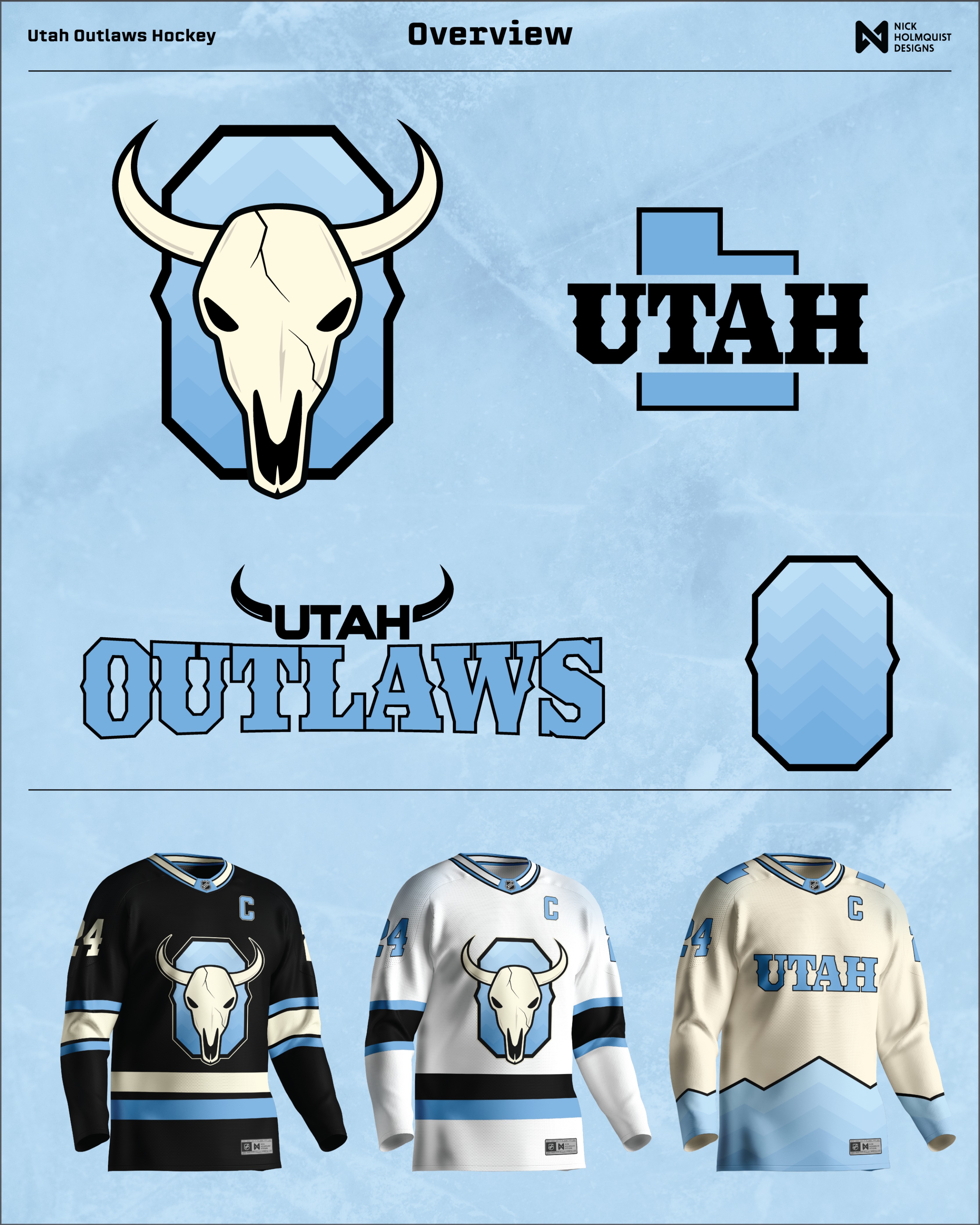
Outlaws 2.0 wasn't an iteration. It was a full restart. The cowboy bandit got scrapped. The replacement: a bull skull primary on an octagonal shield, bull horns wrapping the UTAH wordmark, and the UTAH letterform locked into the silhouette of the state itself. Built in the official light blue, black, white, and cream from the start. The new direction reads more sports identity, less Western movie.
Yeti 2.0 was the most polished single direction. The team rejected Yeti in January 2025 over a trademark conflict with Yeti Holdings, but until that ruling, Yeti was the runaway public favorite. The 2.0 is what the team would have looked like if the trademark had cleared.
The detail people kept commenting on.
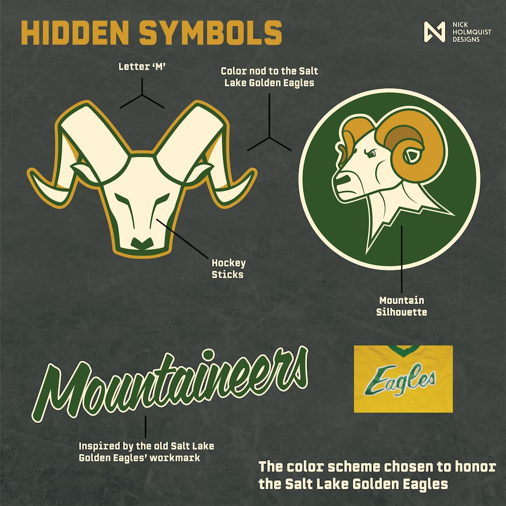
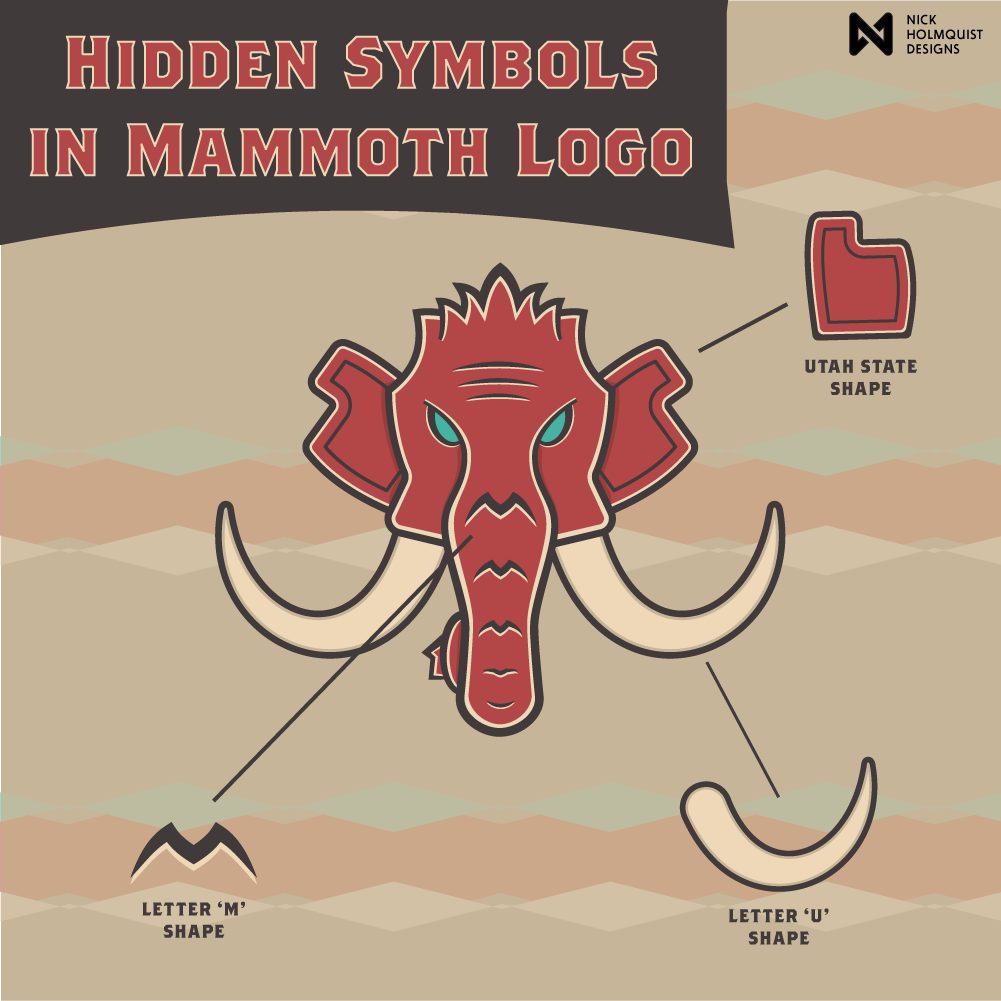
Across the project, the single piece of feedback that came up most often, across every platform, was about the local references built into the marks. Not the jersey designs. Not the palettes. The hidden symbols inside the primary logos.
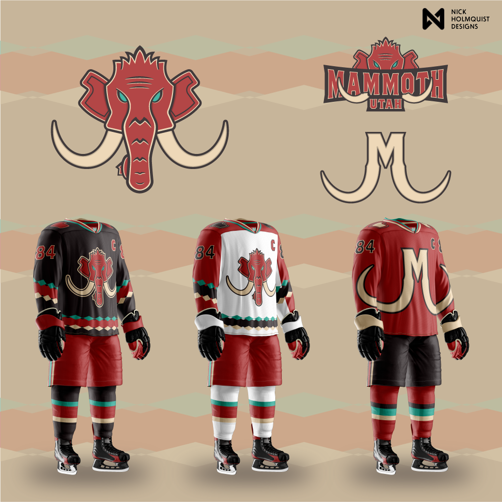
The Mammoth has a Utah state shape in the ears, an M in the meeting of the tusks, a U in each tusk's curve. The Mountaineers has an M in the negative space between the horns, hockey sticks in the goatee, and a palette and script wordmark that honor the Salt Lake Golden Eagles. The Black Diamonds has the Utah state shape in the center diamond, mountain peaks at the top, the three-diamond cluster naming the hardest ski-run rating, and a specialty jersey drawn from ski patrol uniforms.
None of those references are required for the marks to function. The marks read fine without them. But they're the thing fans pointed at. Building references into the construction of a logo, where a viewer who looks closer is rewarded, is most of what concept work can do that finished client work often can't. Client work usually has a brief that resists this. Concept work doesn't have a client to talk you out of it.
Three directions, eight referenced symbols, two custom wordmarks. That's the working method. Reception across Reddit, Instagram, X, and Facebook made it clear it was the most distinguishable thing about the work.
I posted Mammoth five days before the official poll. The team picked Mammoth a year later.
The franchise's relocation was confirmed April 18, 2024. The team's official twenty-name poll dropped May 8. I posted a full Mammoth direction on May 3, five days before the poll list went public. Mammoth was on the list. The team made it a finalist in June 2024. Then they survived the trademark loss of Yeti, the public favorite. On May 7, 2025, the team officially revealed Mammoth as the franchise's name.
I didn't predict the name. I picked one of the obvious candidates a few days before the team validated it. But the system I'd designed for Mammoth in May 2024 made specific structural moves: the Coyotes-era southwestern palette of red, black, cream, and teal, treated as a legacy to honor rather than a brand to bury. A heavy frontal mammoth head with teal eyes and forward-curving tusks. And construction details built into the mark itself: a Utah state shape hidden in the ears, the letter M formed by the tusks meeting at the trunk, the letter U in the curve of each tusk. The kind of work a real franchise identity holds up to.
The lesson isn't that I called the name. The lesson is that working in public, on a real brief, before the client has hired anyone, is one of the highest-leverage things a sports identity designer can do. Either your direction is somewhere near where the team lands, in which case the work compounds. Or it isn't, in which case you've still produced a finished system that anyone considering hiring you can see. Both outcomes are useful.
I posted Venom. I pulled it down.
Somewhere between Blizzard and Yeti 2.0, I built a Venom direction. Posted it. The feedback was immediate and consistent across platforms. Multiple respondents read the primary mark as anatomical. It wasn't the intent and it wasn't recoverable through tweaks. Killing it was cheaper than defending it.
The Venom direction isn't shown here, on purpose. Showing it would undercut why removing it mattered. The point isn't the mark. The point is that the audience told me what they saw, and what they saw was the actual mark, not the one I drew. A designer who can't separate intent from reception is going to ship work that fails the same way again.
Most concept work is judged by the marks that survive. The work I'm most proud of from this project is one that didn't.
Concept work that gets noticed is concept work that builds something into the mark.
The sports identity world has a cottage industry of concept artists, and most of it lives at the level of single marks on flat backgrounds. The bar to do this seriously is higher. Real concept work means committing to full systems, posting them dated, accepting public critique, and iterating in front of an audience. Anything less is mood-boarding.
The other thing the project taught me, which the easter-egg feedback made concrete: a logo that just looks like a logo is doing half the job. A logo with three references built into its construction that a local viewer can find, read, and feel ownership of is doing the other half. The marks people repost are the ones that reward closer attention. That's not decoration. That's the design.
Across thirteen months, nine named directions, multiple recolors, one pulled mark, and a working audience across four platforms, the project produced something a portfolio piece can't fake: a documented record of how I work when the brief is moving and the audience is responding in real time. A team hiring a brand designer for an actual franchise is hiring against exactly that. The case study is one piece of evidence that the work holds up under those conditions.
The other thing the Mammoth moment makes concrete: good guesses in this industry aren't lucky. They're the result of paying close enough attention to a community to know what name will feel right when the team picks it. That attention is most of the job.