Redesigning the Utah State Flag.
A competition entry for the state's More Than A Flag initiative. One of 70 designs recognized by the Utah State Legislature as inspiration for the final adopted flag.
How eight initial directions narrowed to two finals. The specific sources behind each color, star, and angle. What happened at the State Capitol on February 7, 2023.
Utah opened its state flag up to anyone with a steady hand.
In 2022, the State of Utah announced an open competition to redesign the state flag. The existing flag was a state seal on a blue field. Functional, but indistinguishable from a dozen other state flags at a distance, and built for a different era. The brief was simple. Submit a design. Anyone could enter.
I didn't enter to win. I entered because the prompt is one of the cleanest problems in graphic design. A flag has to mean something specific, look like something distinct, and survive every size from a phone screen to a windblown pole. If you can solve that for a state you actually live in, you're learning something the next paid project will need.
Vexillology has rules. Most flags break them.
The North American Vexillological Association's guidance is short and uncompromising. Use two or three basic colors. Keep it simple enough a child can draw it from memory. Use meaningful symbolism. Avoid lettering and seals. Be distinctive. Most US state flags fail at least three of those at once.
The harder constraint was Utah itself. The state's identity is densely packed with specific symbols. The beehive. The motto of industry. The mountains. A pioneer history that means very different things to different residents. I wanted a flag that kept what mattered without literalizing it. Something that read as Utah without illustrating Utah.
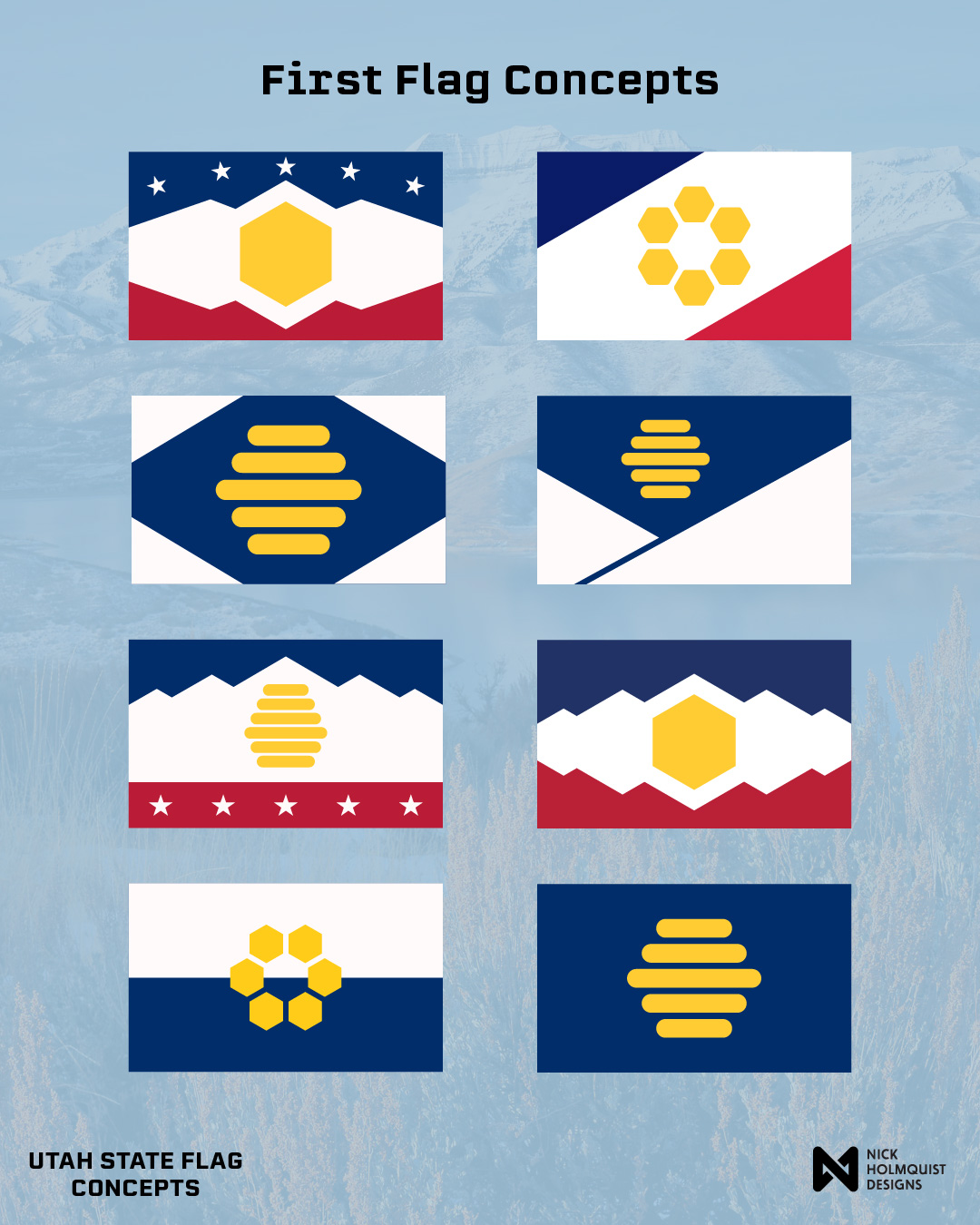
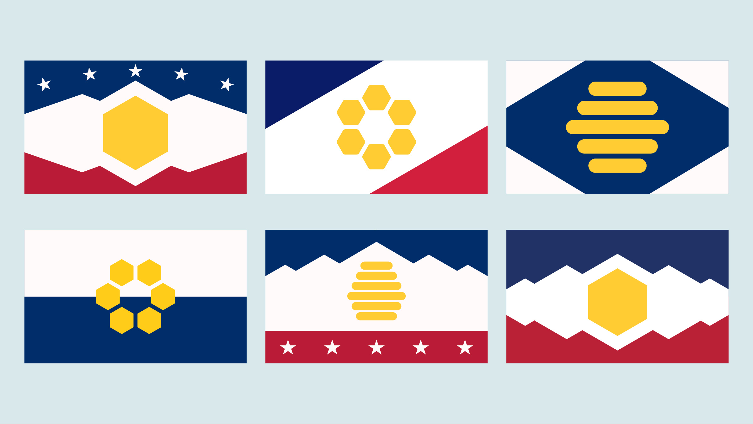
Eight directions, then a clear pair.
The first round wasn't about taste. It was about reducing the variable space. Each composition tested one decision at a time. Whether the beehive should appear as the literal beehive icon, as a hexagonal honeycomb cluster, or as a single hex cell standing in for the whole hive. Whether the mountains should sit as a silhouette dividing the field or as a horizon line. Whether to keep the heritage navy-white-red palette or trade tradition for legibility.
After living with the grid for a few days, a pattern emerged. The strongest directions all shared three moves. Mountain silhouettes as the structural divider. The heritage tri-color, kept. A single gold hexagonal cell as the beehive's stand-in. Everything else was noise.
"I wanted a flag that kept what mattered without literalizing it. Something that read as Utah without illustrating Utah."
I narrowed to two finals. Same structural logic, different opening notes. One leans on a canton of stars. The other lets the mountain ridge do all the work alone. Submitting two gave the committee a choice without splitting the design language.
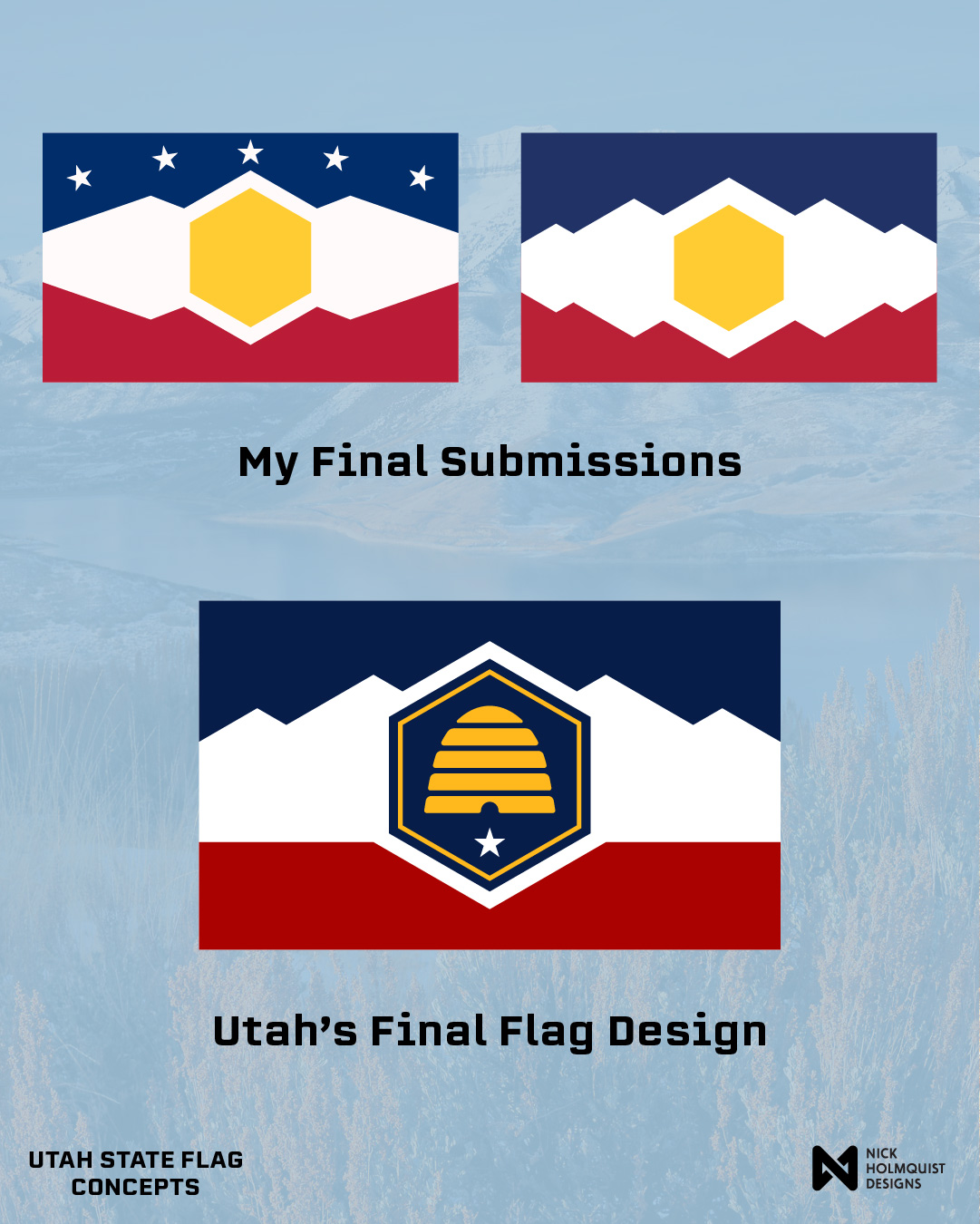
What both finals share.
Same structural logic in both. Mountain silhouette as the divider. Heritage tri-color, kept. Gold hexagonal cell at the center. The only meaningful difference between the two is the canton: one carries five white stars, the other lets the geometry do all the talking.
Both moves carried through to the design Utah eventually adopted. The state's final flag uses a mountain silhouette dividing a navy, white, and red field, with a beehive sitting inside a hexagonal badge. A separate process arrived at the same structural answer. That convergence is part of why mine was among the designs the state recognized.
Every choice has a source.
A flag has too few elements for any of them to be filler. Each color, each shape, each angle was a decision with a reference behind it. Naming the sources is what separates a flag that looks like Utah from one that just looks like a flag.
Sampled from Utah's historic state flag, the same blue that has carried the state's identity since 1913. There was no reason to redesign what already worked. Using the same navy was a way to honor the legacy rather than replace it. The state's final adopted flag made the same call.
The color value is US flag red. The symbolism, on a Utah flag, is southern Utah's red rock landscape. Two references inside one color. The choice keeps the new flag in conversation with the American flag tradition while pointing at the geography that makes the state feel like itself.
Sampled from Sunglow, the Crayola color renamed "Bee-UTAH-ful" in the company's 2004 State Your Color contest. A seventh-grader from Murray named Rusty Griggs gave it the name, picked from 220 Utah entries by a Crayola committee for the first state-themed pack in Crayola's 100-year history. Bee-UTAH-ful is the kind of small, lower-case piece of state identity that won't show up on any official register. Using it as the flag's yellow is a quiet inside reference for the Utahns who would know.
Two readings of the same five points. The Mighty 5 national parks: Arches, Bryce Canyon, Canyonlands, Capitol Reef, Zion. And the five federally recognized tribal nations of Utah: Diné (Navajo), Goshute, Paiute, Shoshone, and Ute. The final adopted state flag also lands on five-pointed symbolism for the tribal nations.
A clean abstraction. Not the Wasatch, not the Uintas, not any specific range. A composed ridge that any Utahn would recognize as home without claiming a particular one. The mountains are also the structural divider for the flag, separating navy from white from red.
The single beehive cell standing in for the whole hive. Utah is the Beehive State. A hex is the unit a beehive is built from. Drawing the abstract unit instead of the literal beehive icon gives the flag a symbol that scales. It reads at jersey distance. It survives a one-color pin. It works on a phone.
The peaks of the mountain ridge are cut at the same angle as the sides of the hexagon. The kind of decision a viewer would not consciously notice but would feel as cohesion. The composition holds together because the geometry across the flag is the same geometry.
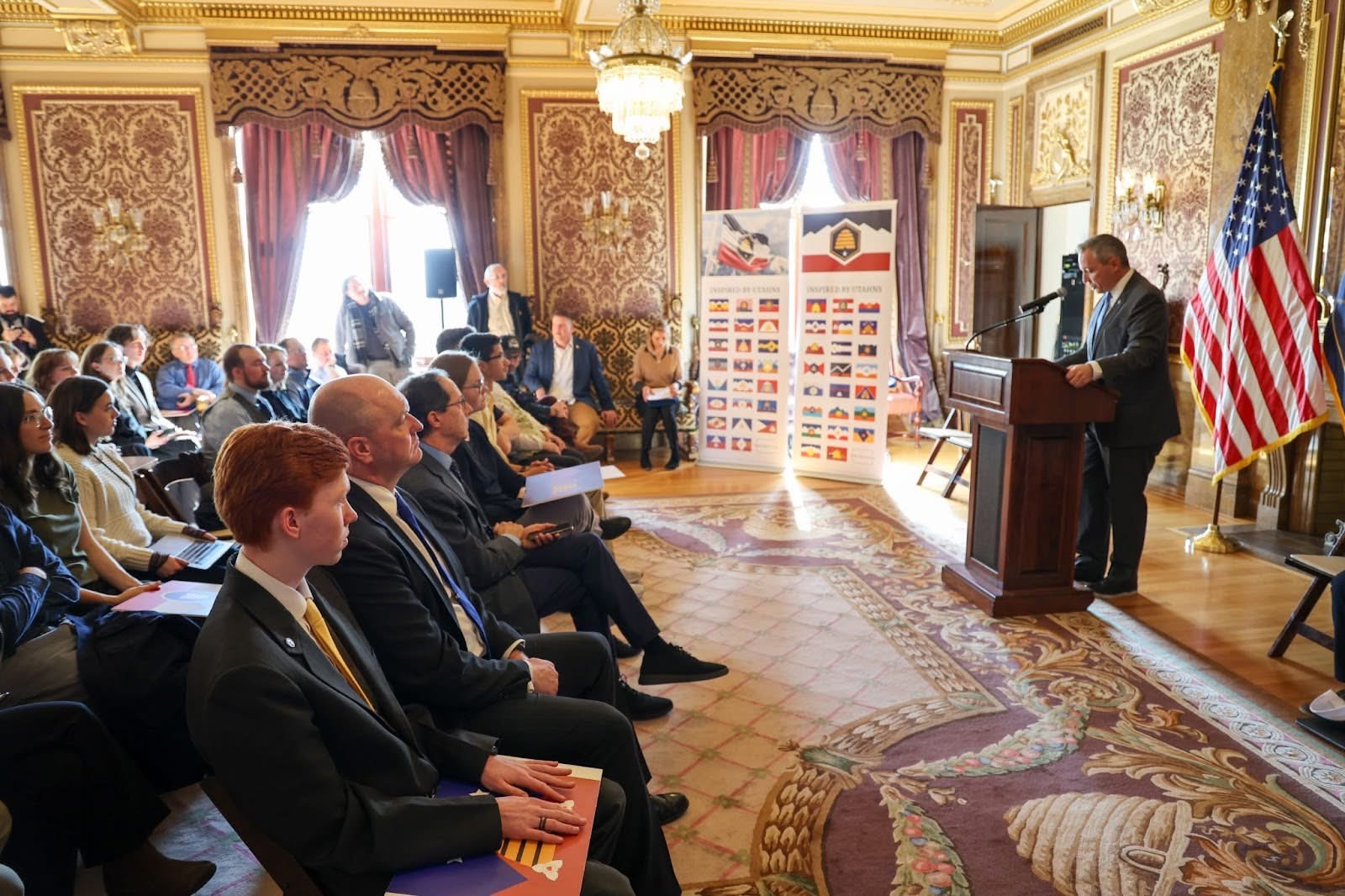
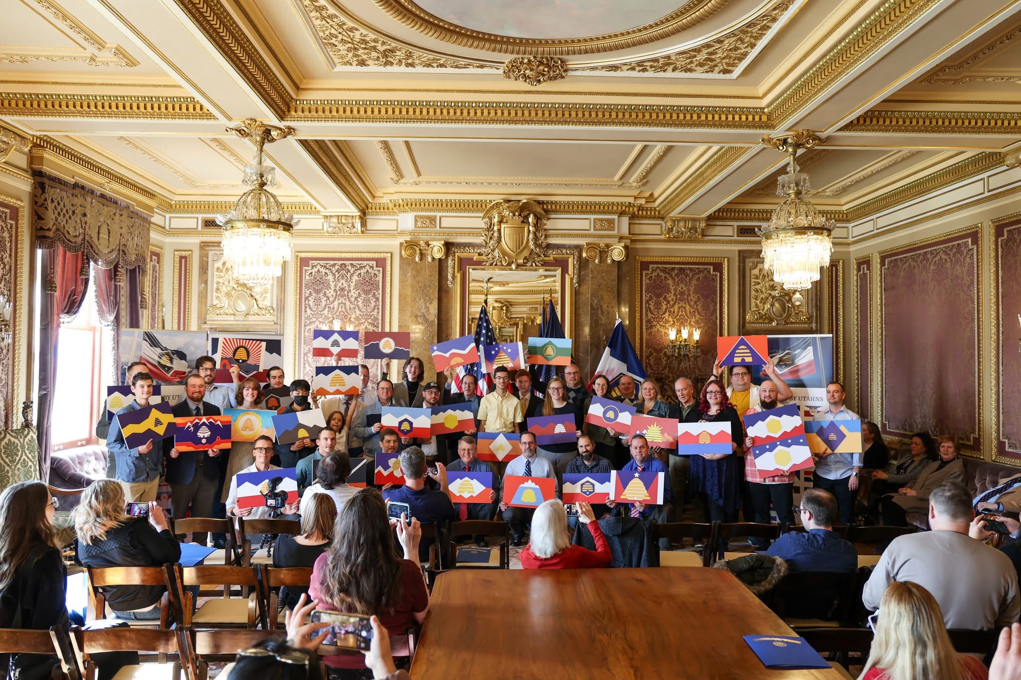
Honored at the Utah State Capitol.
Out of 5,703 flag designs submitted to the More Than A Flag initiative, 70 were recognized by the Utah State Legislature as having inspired the final adopted flag. Mine was one of them.
On February 7, 2023, the Legislature held a ceremony in the Gold Room of the Utah State Capitol. Senator Dan McCay, who sponsored the flag bill, presented the recognition alongside Senator Jake Anderegg and Representative Robert Spendlove. The $5,000 the state had originally set aside for a single winning design was instead split into 70 shares, one for each honoree. Each of us was called by name, given a cardboard cutout of our flag, and asked to sign the banners around the podium.
The Deseret News covered the ceremony. The crowd ran from elementary school students to retired designers, from across Utah and a few from outside it. McCay said each contributor would be memorialized in state history. It's the only project I've worked on that came with that sentence attached.

The format does more of the work than I expected.
The most useful thing about a flag brief is what it refuses. No lettering. No seal. No gradient that won't print. No flourish that doesn't survive a stiff wind. Every constraint pushes the design toward the same destination. The simplest mark that still means something.
That refusal is what makes flag work compound into other work. Brand identity has the same physics. Logos don't get good by adding. They get good by losing everything that wasn't earning its place. Three months on a flag I never expected to win was the cheapest way I've ever bought that lesson.
The other thing that stayed with me. Civic design is reviewed by people who don't read design Twitter. The committee included educators, veterans, tribal representatives, schoolchildren who voted on the finalists. The work has to land for an audience that doesn't share your vocabulary. That's a useful corrective for anyone who designs for a living.