NHL Midnight Edition.
Dark-mode alternate identities for all 32 NHL teams. Started as a two-team blackout experiment during the 2024 Stanley Cup Finals. Expanded over the following weeks into a complete league system, presented division by division.
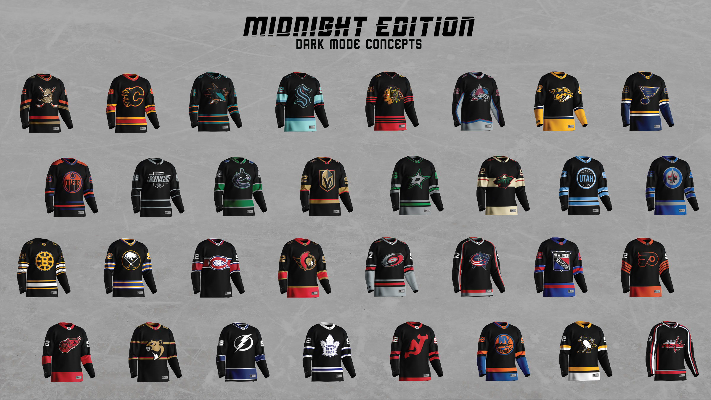
Thirty-two dark-mode alternate jerseys, presented eight at a time across four divisions. Started with the two teams in the 2024 Stanley Cup Finals and grew into a complete league set. A creative break from Utah Hockey, and a study in how an NHL jersey is actually built.
A break from Utah, and a deep dive into how a jersey is actually built.
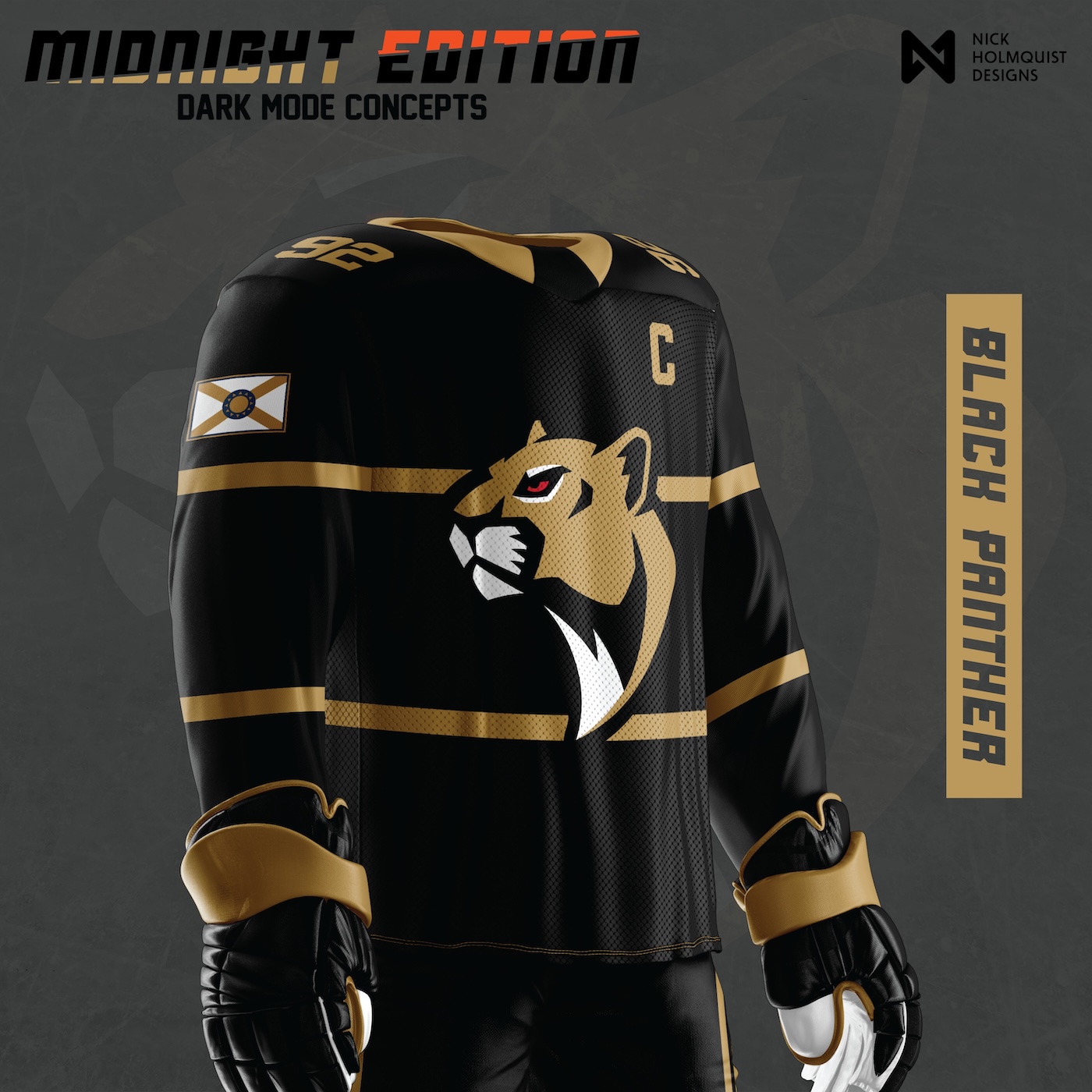
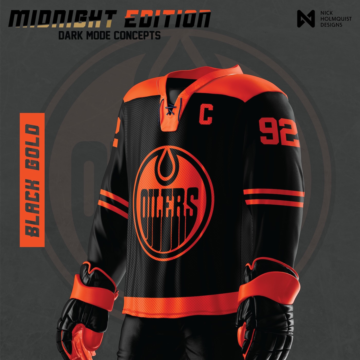
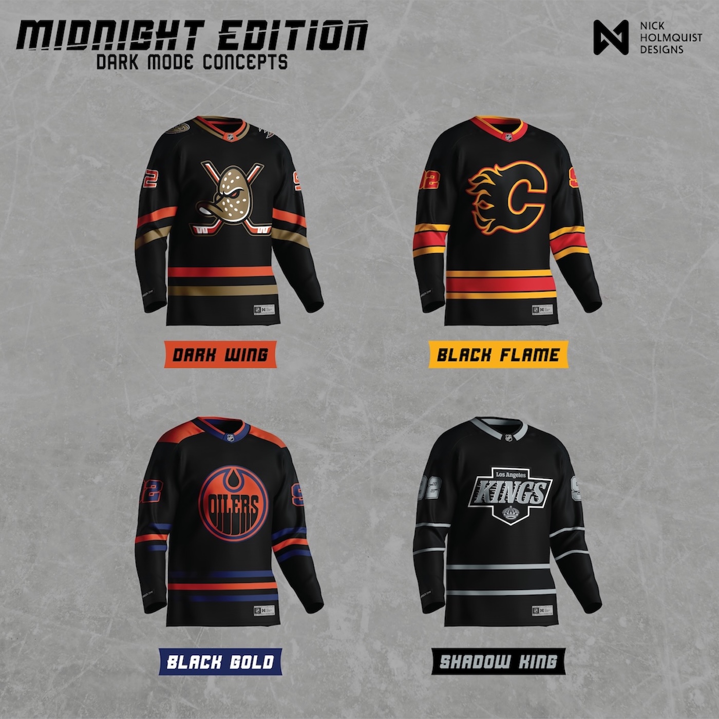
By June 2024, I'd been working on Utah Hockey concept directions for over a year. The project was producing, but I needed a change of scenery. The 2024 Stanley Cup Finals were starting. Florida Panthers and Edmonton Oilers. I designed a blackout alternate jersey for each, with original names: Black Panther and Black Gold. Two teams, posted for fun, with no plan past that.
The other half of the why was technical. I wanted my mockups to be more realistic. A jersey concept that doesn't honor how an NHL jersey is actually constructed reads as a t-shirt with a logo on it. Where the panels meet, where the stripes wrap, how the chest crest sits next to the laces, how sleeve numbers interact with cuff striping. The Utah Hockey work had pushed the brand side as far as I could push it on my own. This project was for getting better at the cloth.
Two teams, two original names, posted during the 2024 Stanley Cup Finals.
The first pair didn't have a system name yet. Black Panther for Florida. The team's logo and palette pulled into a near-black treatment. Black Gold for Edmonton. The Oilers' royal blue dropped into a deep navy, the orange holding its weight against the dark.
The names were mine. The Black Panther reference is the obvious one. Black Gold is the term for crude oil, which is the team's actual namesake. Both names earned themselves into the project by surviving the first round of feedback. The system label "Midnight Edition" came later, when the project expanded past these two.
Thirty-two jerseys, eight at a time, division by division.
By July 2024, the response to Black Panther and Black Gold was enough to justify the next move. Do the league. All 32 teams. The naming convention got a system label: Midnight Edition. The bespoke names from the origin stayed.
The rollout discipline mattered. Posting 32 jerseys in a single drop would have buried every individual concept under the next one. Instead I went division by division, four teams in one drop, four more the next day. That gave each team a moment of its own and gave the audience a reason to come back.
Day 1Ducks, Flames, Oilers, Kings.
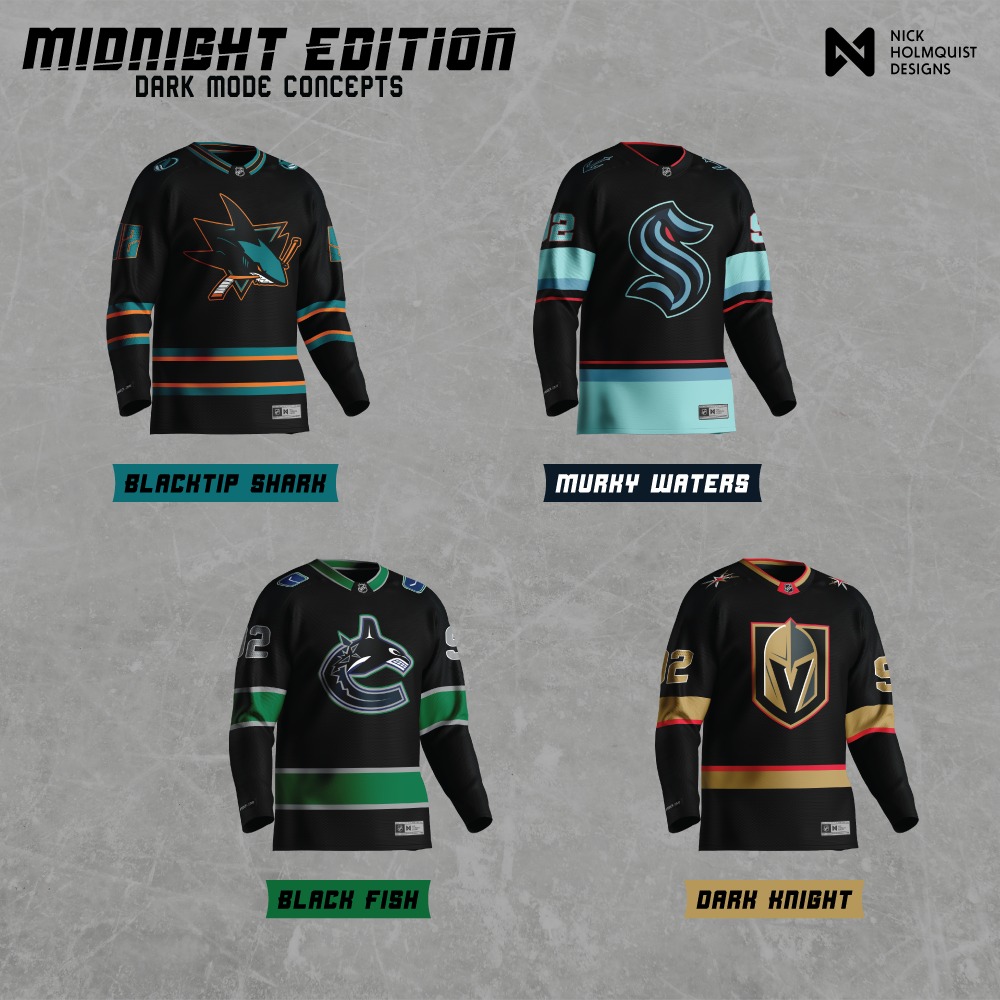
Day 2Sharks, Kraken, Canucks, Golden Knights.
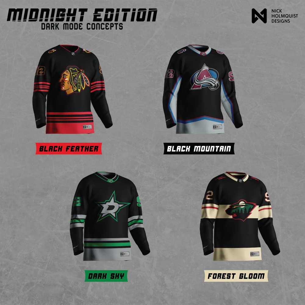
Day 1Blackhawks, Avalanche, Stars, Wild.
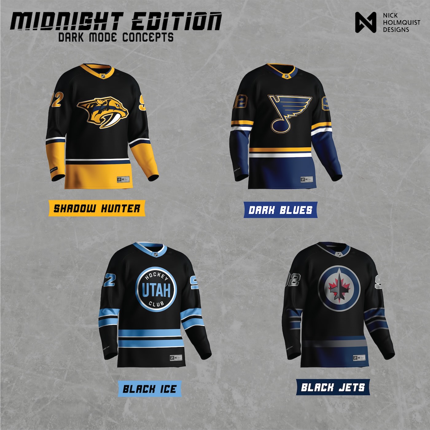
Day 2Predators, Blues, Utah Hockey Club, Jets.
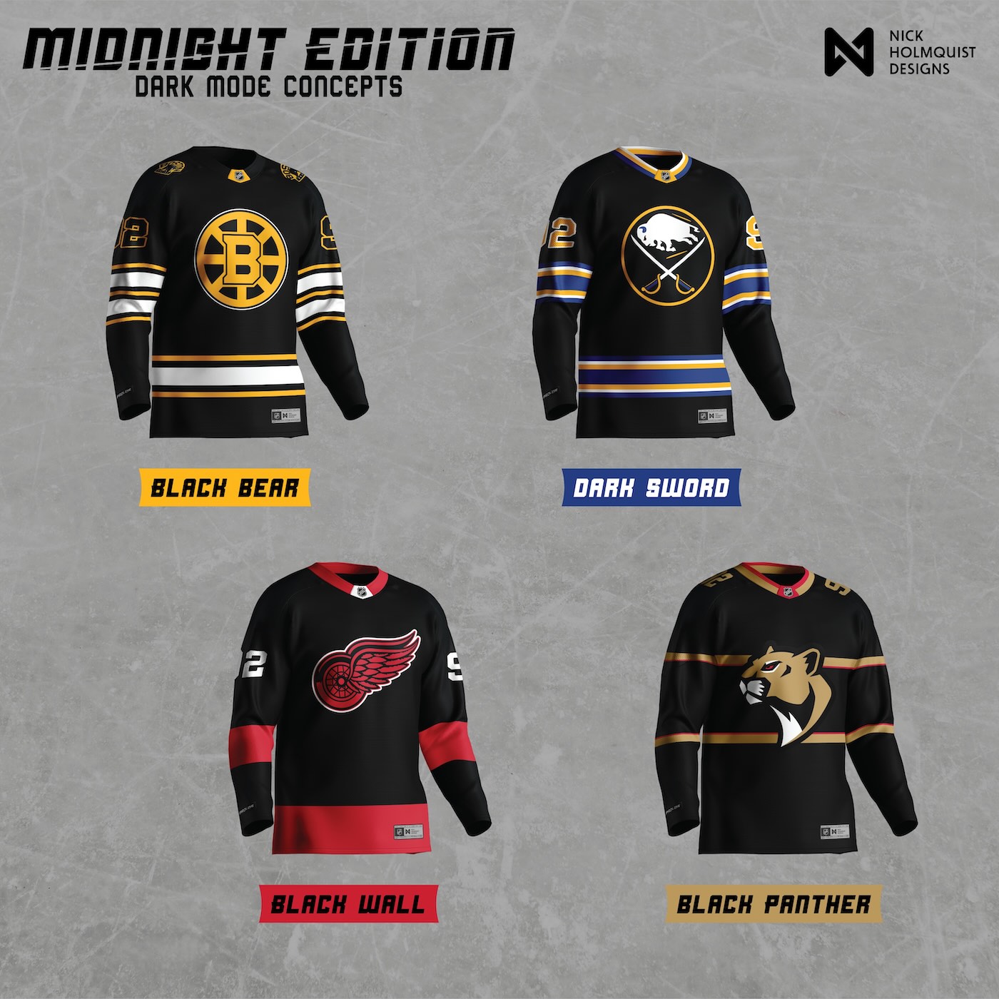
Day 1Bruins, Sabres, Red Wings, Panthers.
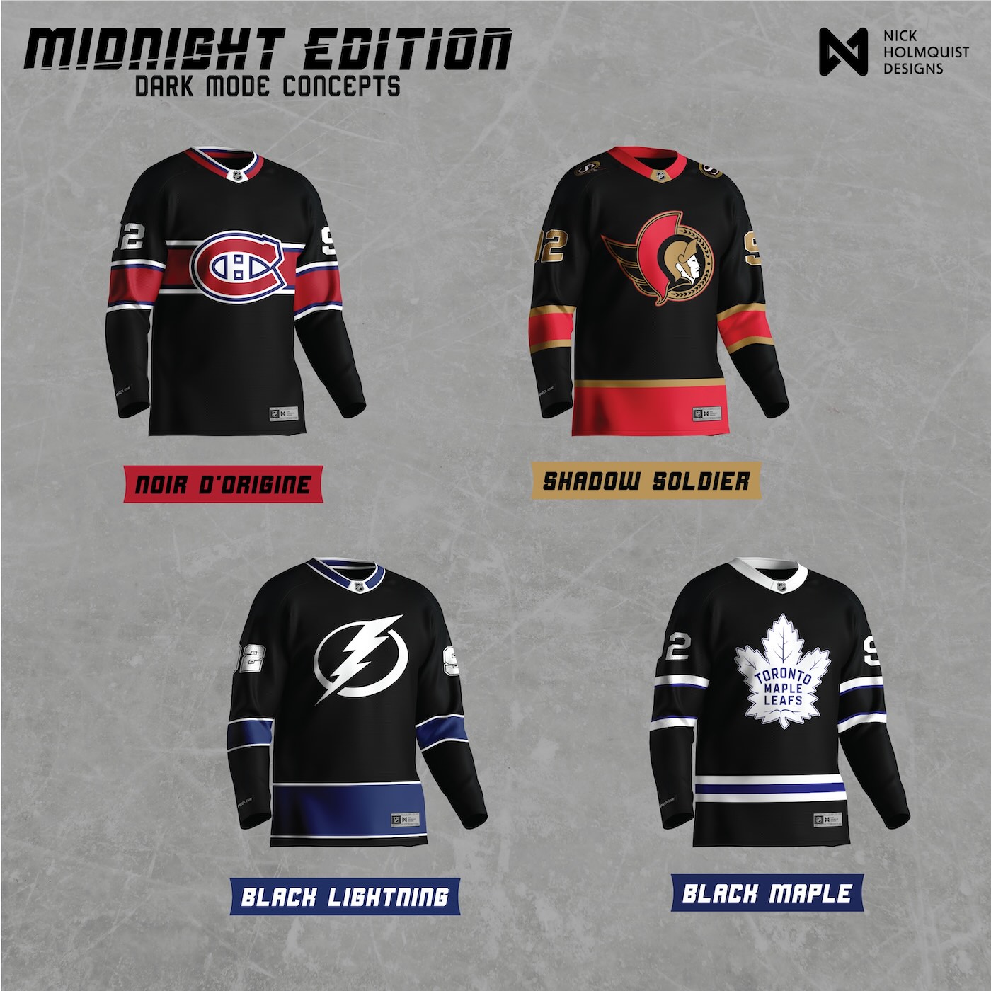
Day 2Canadiens, Senators, Lightning, Maple Leafs.
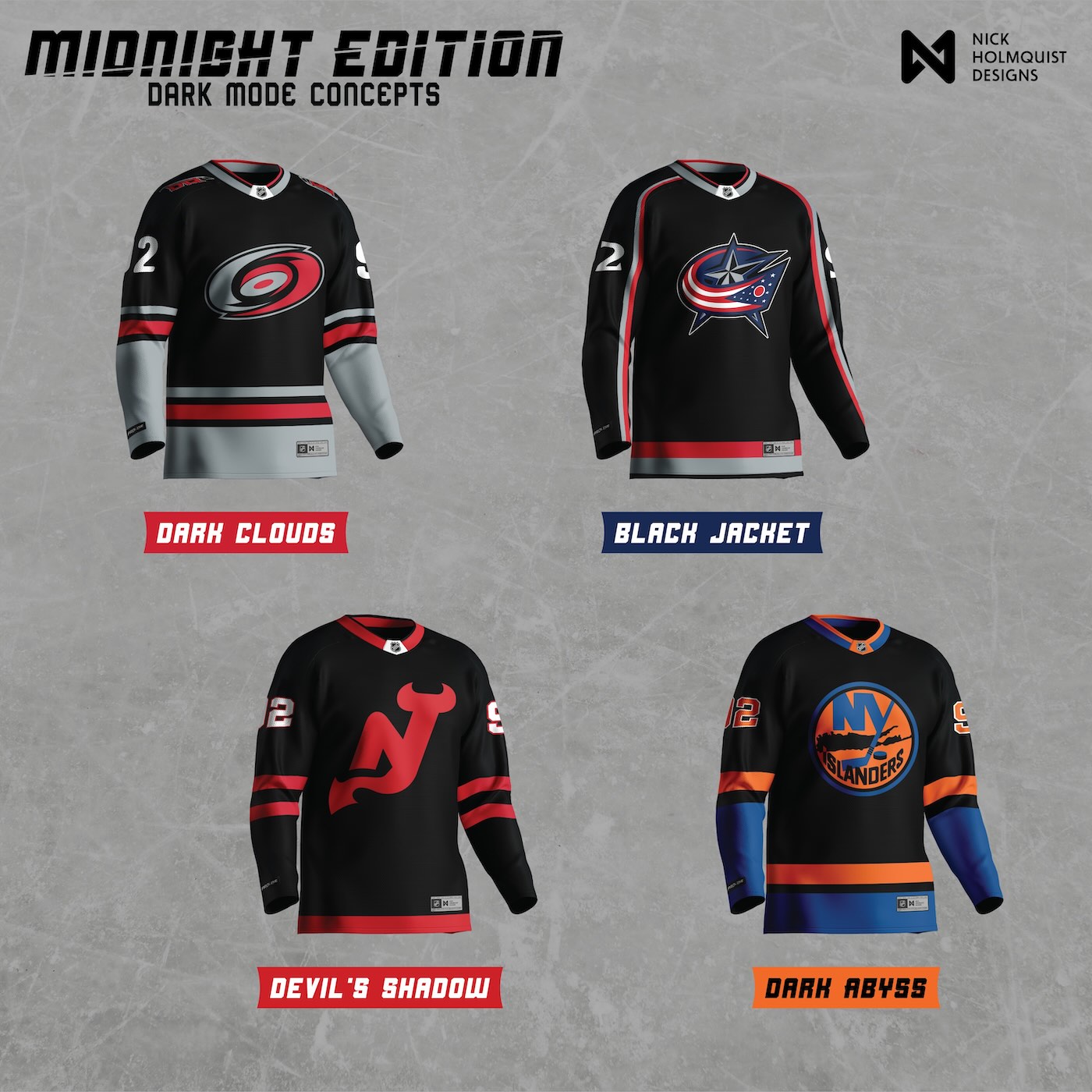
Day 1Hurricanes, Blue Jackets, Devils, Islanders.
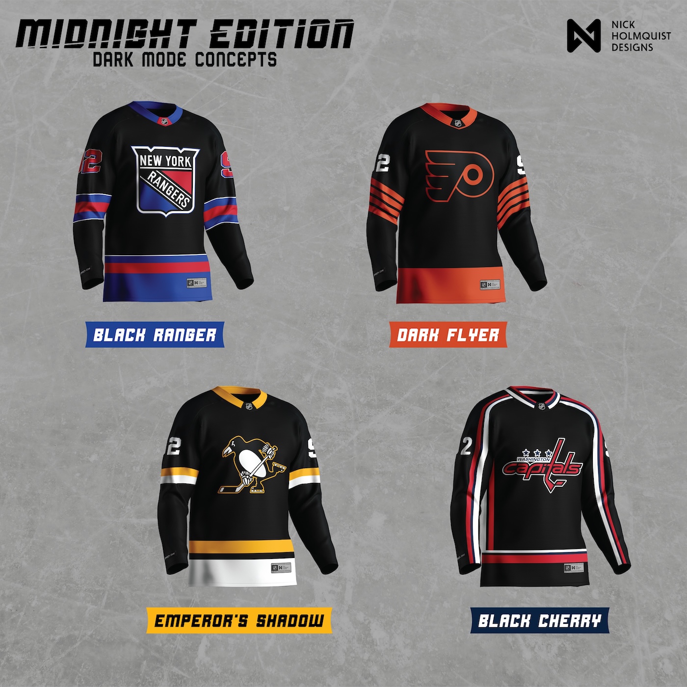
Day 2Rangers, Flyers, Penguins, Capitals.
What thirty-two teams ask of one system.
A few decisions held the project together.
The blackout palette is the system, not the look. Each team keeps its own identity inside a near-black register. The Penguins are still the Penguins. The Stars are still the Stars. The Midnight Edition treatment is what they all share. The differentiation is what they all keep.
Bespoke names only for the original two. Black Panther and Black Gold earned their names through the Finals moment they were posted in. Trying to invent thirty more original alternate names would have either watered them down or pulled focus away from the visuals. The system label does the job for the other thirty.
The rollout cadence was a design decision. Four teams in one drop, four more the next day, then on to the next division. Posting all thirty-two at once would have hidden the individual work. Spacing the drops gave each team its own moment and built sustained engagement across the project.
Honoring jersey construction was the technical goal. Panel seams, stripe wraps, crest placement relative to the laces, sleeve number positioning, cuff striping. Concepts that ignore these details read as t-shirts with logos on them. The goal across all thirty-two was a mockup that an NHL designer could look at and not immediately catch.
Designing for one team teaches a brand. Designing for thirty-two teaches a system.
The project started as a break from Utah and ended as the largest single body of sports identity work I've done. Thirty-two teams is the kind of scope that's only possible when the brief is your own. No client would commission this. No team would want the rest. The completeness is what makes it a portfolio piece, and the completeness is only possible because it was self-directed.
The other thing the project taught was the difference between brand work and system work. Designing one alternate jersey is a brand exercise. The team is the constraint, and the alternate is the answer. Designing thirty-two alternates from the same palette rule is a system exercise. The rule is the constraint, and the thirty-two answers have to be different enough to be individual and consistent enough to belong to one project. That tension is the whole job.
Reception was mostly positive across platforms, with the predictable amount of pushback that comes from a designer touching every fan base's team at once. The negative feedback was small enough to absorb and specific enough to learn from. A designer who can't read the difference between a real critique and noise won't survive a project this size. The project taught that filter, too.